



My piece for the archive project was a slideshow of lesbian couples projected with the sounds of an old projector.
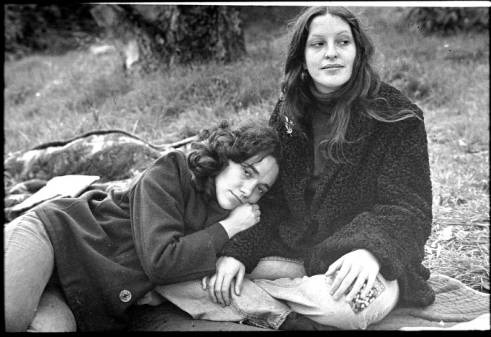
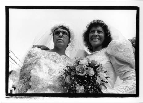
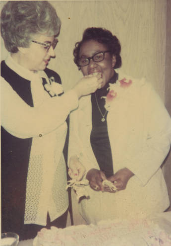
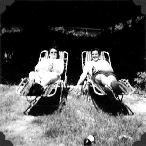
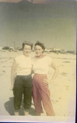
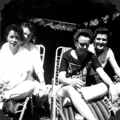
First, the images themselves had a narrative to them. They started out as images of two women standing next to one other, with no explicit tell that they were lesbians. These images progress in a loose chronological order. Then in the 12th photo, there is one final image of two women standing next to each other by a car. The 13th photo of the slide show shows the same two women from the 12th photo (one of them being Carolyn Weathers) kissing. By pairing the two photos back to back, I changed the narrative for the previous 11 photos, implying the fact that all of the women in the photos were lesbians as well (which they were according to ONE archive). After the 13th photo, there are three more photos of women kissing, the last of which appears to be in a public setting. This transitions into the next three photos that depict lesbians at marches and gatherings, with no explicit show of their gayness, but instead, a heavily implied context that they are. The next four photos show a more explicit pairing of two women at these gatherings. The 24th photo depicts a woman in the context of a march wearing a sign around her neck that reads “Just Married”. This serves as the context for the last section of photos that depict lesbian weddings at marches and slowly transition to private lesbian weddings. The slide show ends with a set of three photos. The first is a wedding cake with a wed- ding topper featuring two women, one black and one white, clearly taken within the ‘90s because of the quality of the photograph. The next photo is from 1973 depicting Cora Latz and Etta Perkins’ first wedding. The next and last slide of the show is a photo from 1998 of the same couple in wheelchairs renewing their vows. As for the technical aspect of the visuals, there are two key things to be noted. First, the images don’t fit the screen, they are relatively small. This is done because I wanted to emulate a personal/at-home slide show. Secondly, there are digital aspects to make the video seem more like a slideshow coming from an old projector. The white box is a nod to the fact that when a slide show starts up there is a blank slide sometimes, and it appears again at the end, to mark the end of the slideshow. Another digital effect that I added was a black rectangle that moved up like the shutter of a projector would move up when switching slides.
First, the images themselves had a narrative to them. They started out as images of two women standing next to one other, with no explicit tell that they were lesbians. These images progress in a loose chronological order. Then in the 12th photo, there is one final image of two women standing next to each other by a car. The 13th photo of the slide show shows the same two women from the 12th photo (one of them being Carolyn Weathers) kissing. By pairing the two photos back to back, I changed the narrative for the previous 11 photos, implying the fact that all of the women in the photos were lesbians as well (which they were according to ONE archive). After the 13th photo, there are three more photos of women kissing, the last of which appears to be in a public setting. This transitions into the next three photos that depict lesbians at marches and gatherings, with no explicit show of their gayness, but instead, a heavily implied context that they are. The next four photos show a more explicit pairing of two women at these gatherings. The 24th photo depicts a woman in the context of a march wearing a sign around her neck that reads “Just Married”. This serves as the context for the last section of photos that depict lesbian weddings at marches and slowly transition to private lesbian weddings. The slide show ends with a set of three photos. The first is a wedding cake with a wed- ding topper featuring two women, one black and one white, clearly taken within the ‘90s because of the quality of the photograph. The next photo is from 1973 depicting Cora Latz and Etta Perkins’ first wedding. The next and last slide of the show is a photo from 1998 of the same couple in wheelchairs renewing their vows. As for the technical aspect of the visuals, there are two key things to be noted. First, the images don’t fit the screen, they are relatively small. This is done because I wanted to emulate a personal/at-home slide show. Secondly, there are digital aspects to make the video seem more like a slideshow coming from an old projector. The white box is a nod to the fact that when a slide show starts up there is a blank slide sometimes, and it appears again at the end, to mark the end of the slideshow. Another digital effect that I added was a black rectangle that moved up like the shutter of a projector would move up when switching slides.
Secondly, the slideshow was paired with the audio of an old projector. Viewers could hear the projector start-up and at the end could hear it power off. The hum of the machine at work played as a constant throughout the video. Every 5 seconds the clicking of a slide switching played. This consistency created a rhythm within the piece. The reason I set the duration of the click (and subsequently the photos) to 5 seconds was that I believed that it was just long enough to allow the viewer to sit with the photo and really start to notice details within the photo, but was not so long that the viewer lost all interest in the photo. Five seconds forces the viewer, especially the younger viewer who is so used to quickly flipping through Instagram or other forms of social media at their own quick pace, only viewing a photo for a second. To the viewer who is so used to this control and rapid pace, 5 seconds seems agonizingly long at first, but after a little while, after the viewer realizes the stability in the clicks, 5 seconds seemingly becomes a calm and comfort- able amount of time.
