
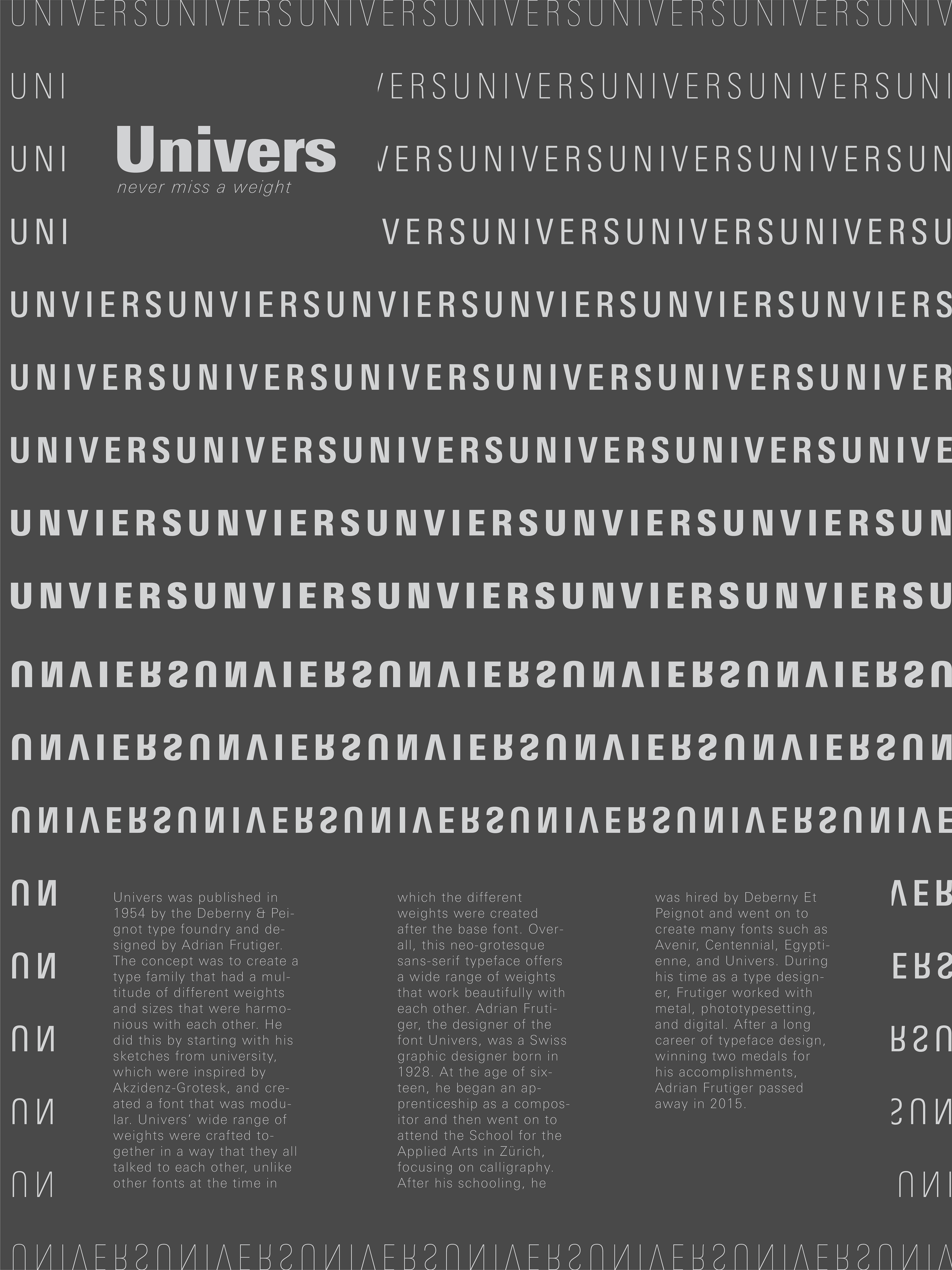
In this project, we were tasked with creating a typeface poster for a font of our choice. My main emphasis for the Univers was this vast array of typefaces since the structure of the font itself is not super unique.
Research:
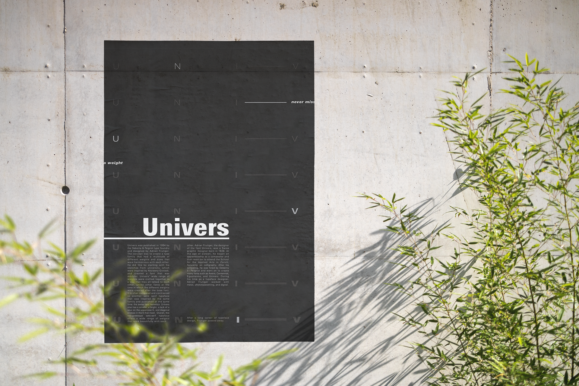
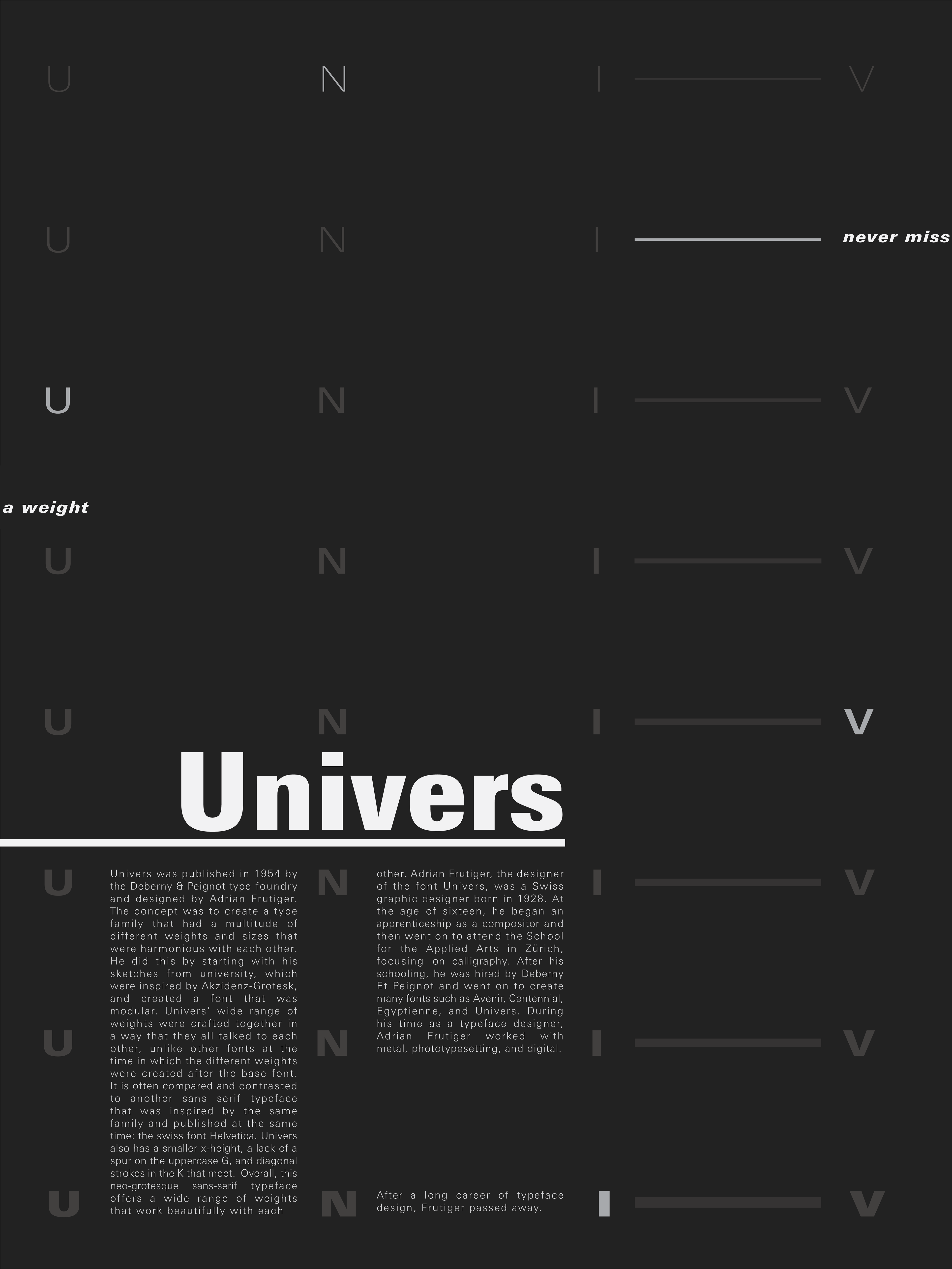
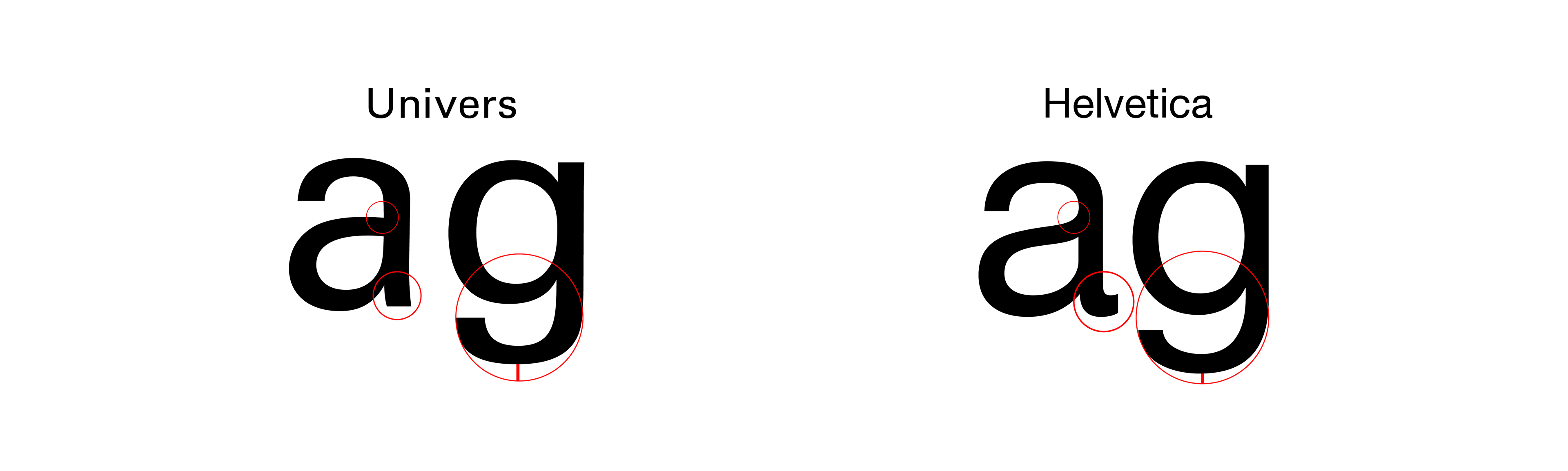
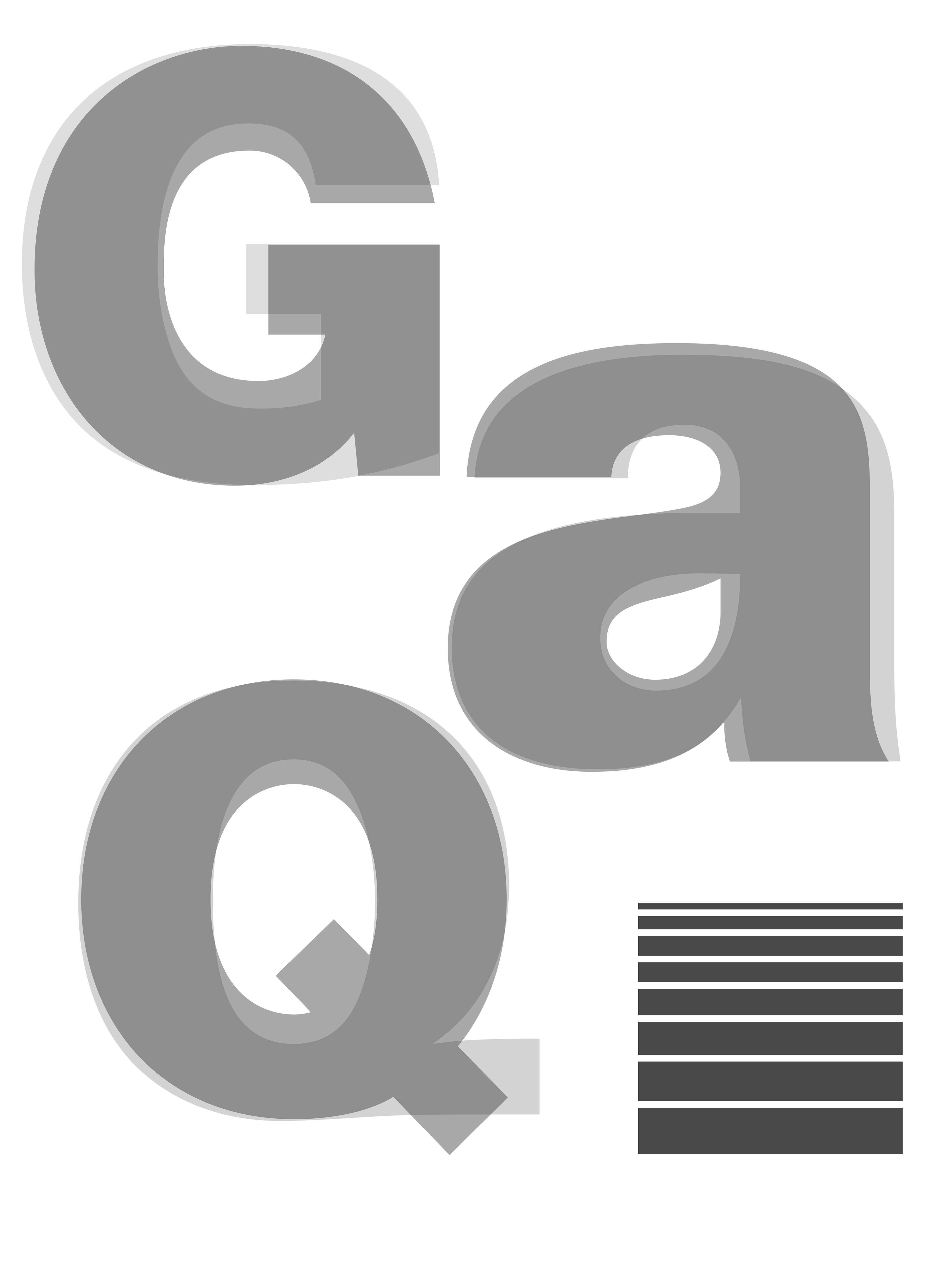
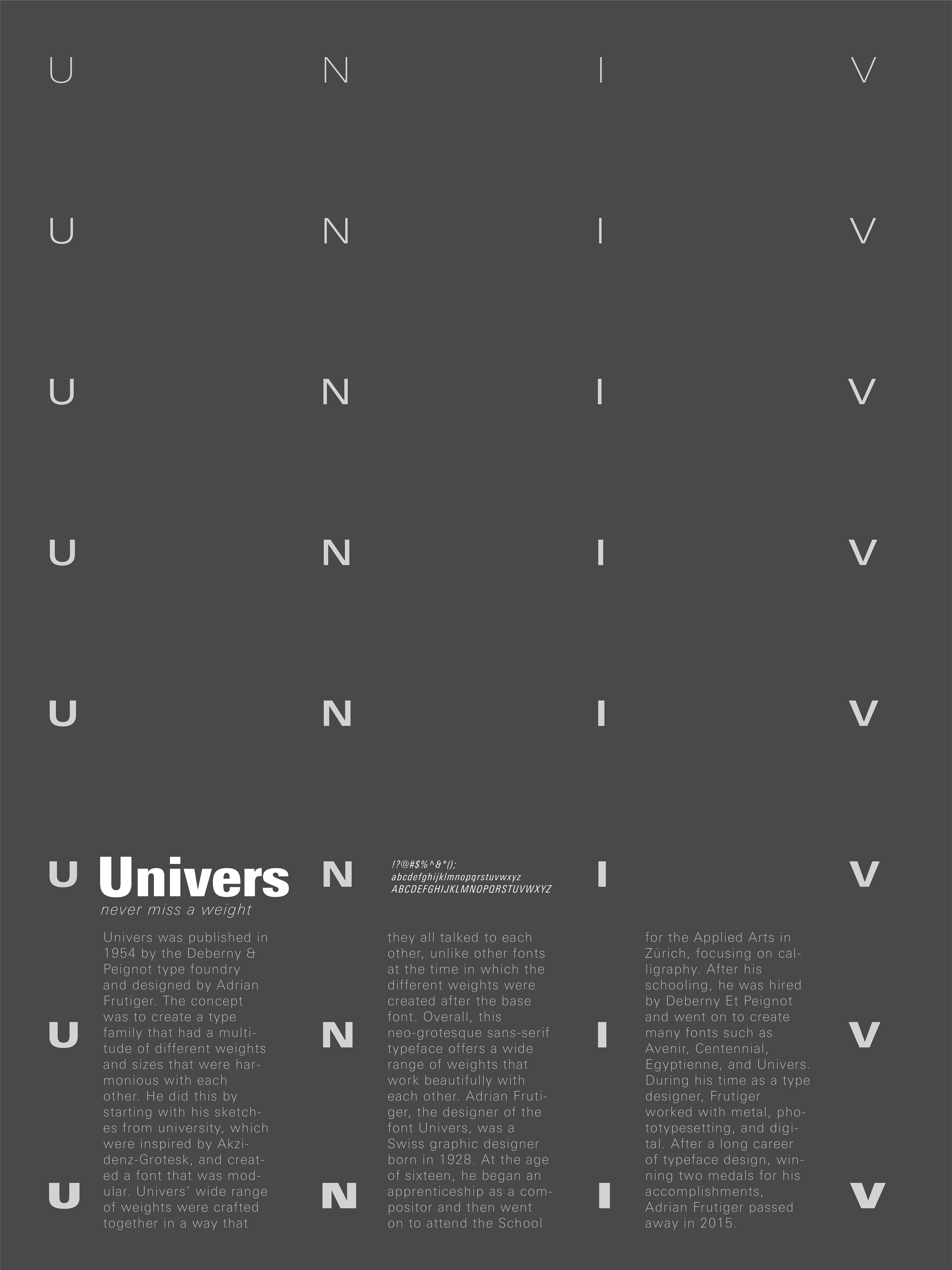
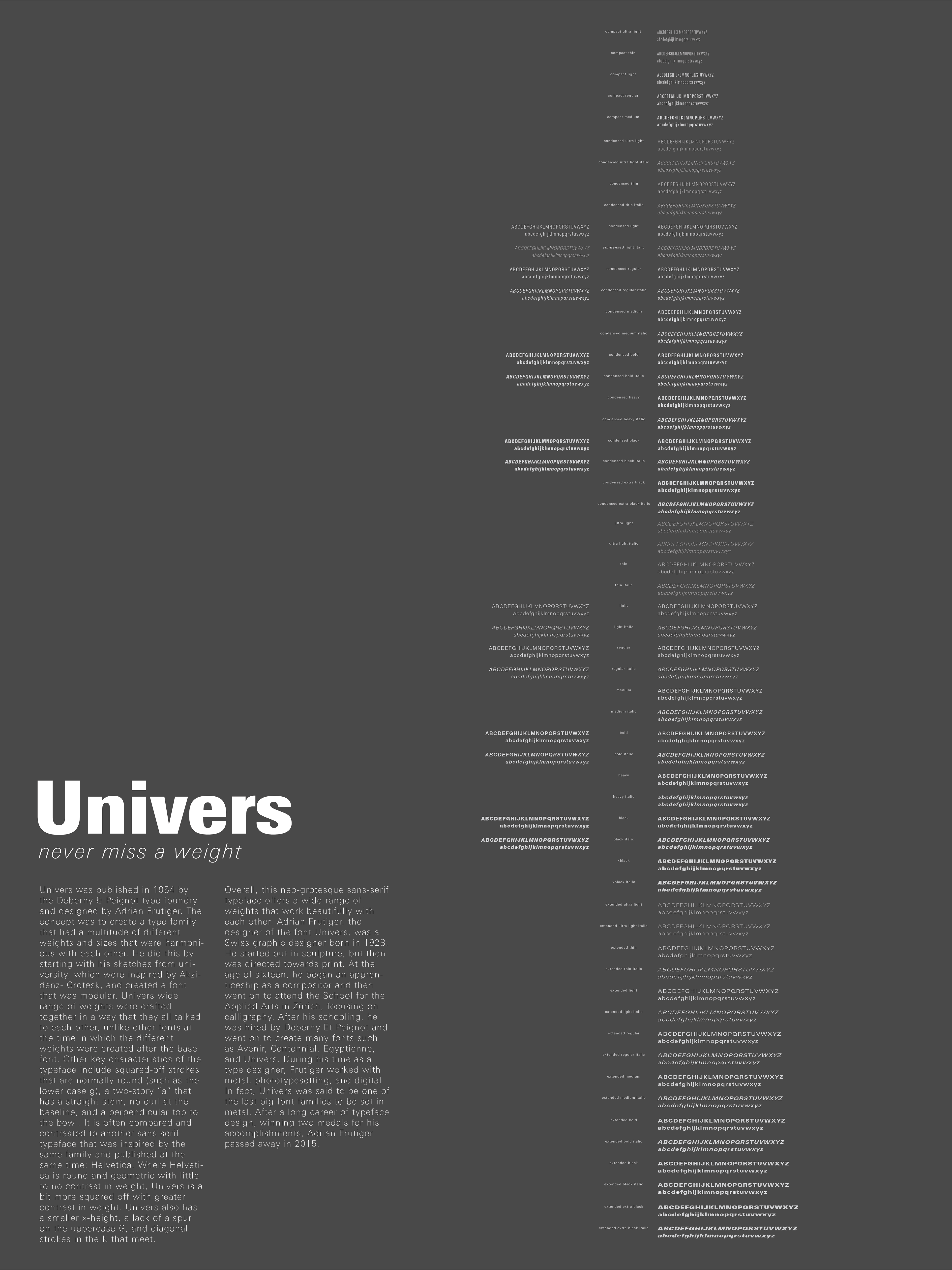
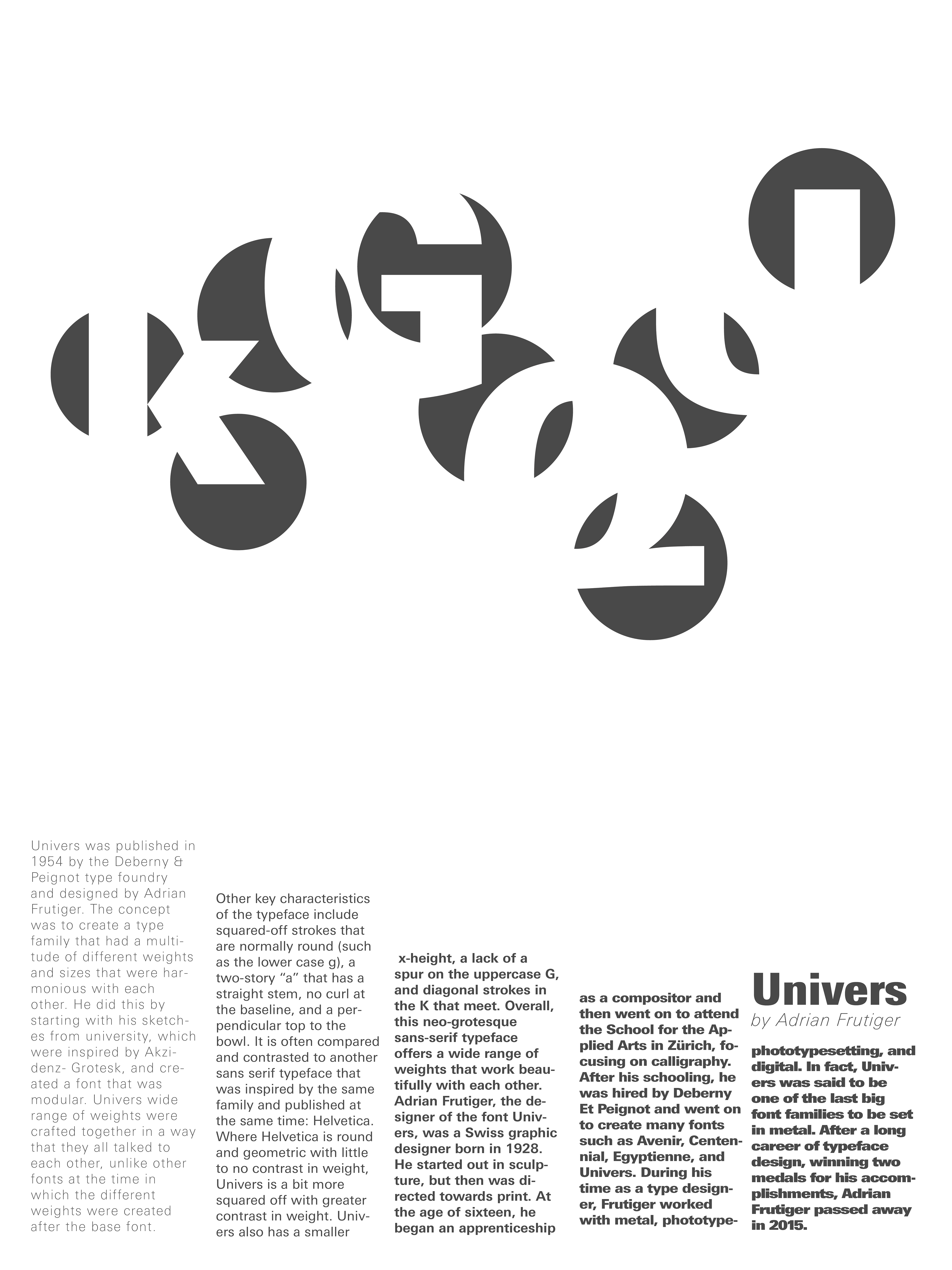
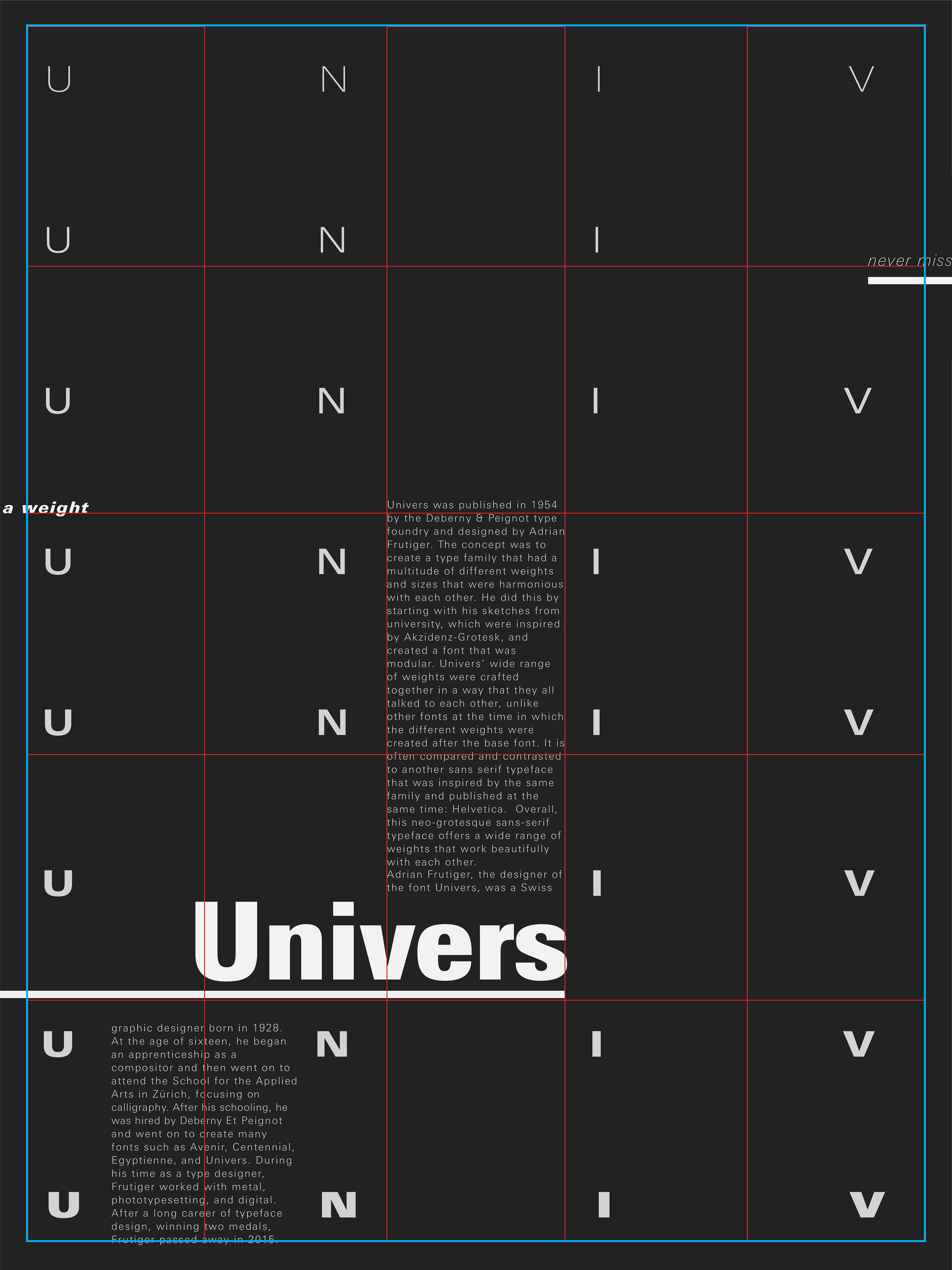
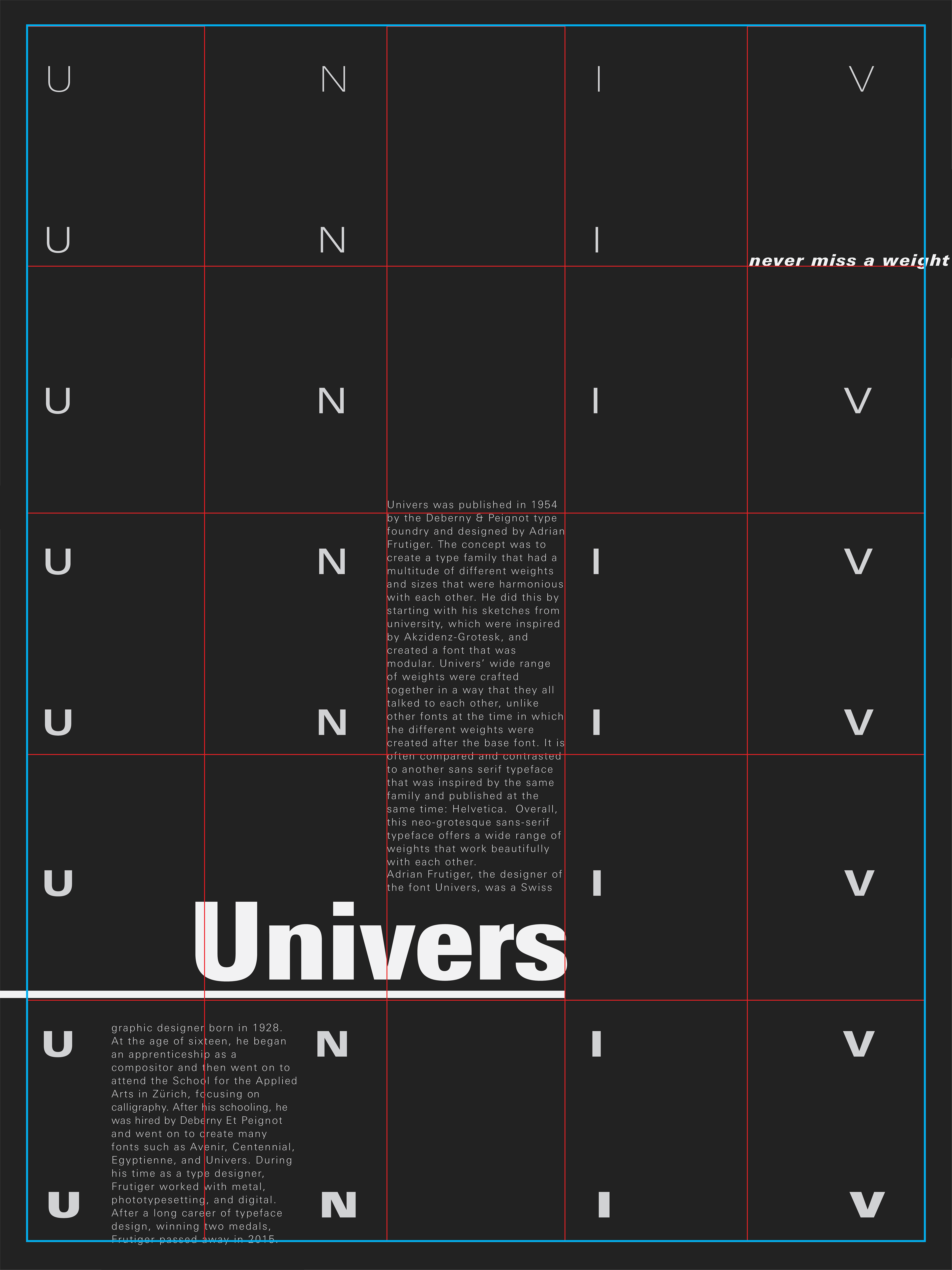
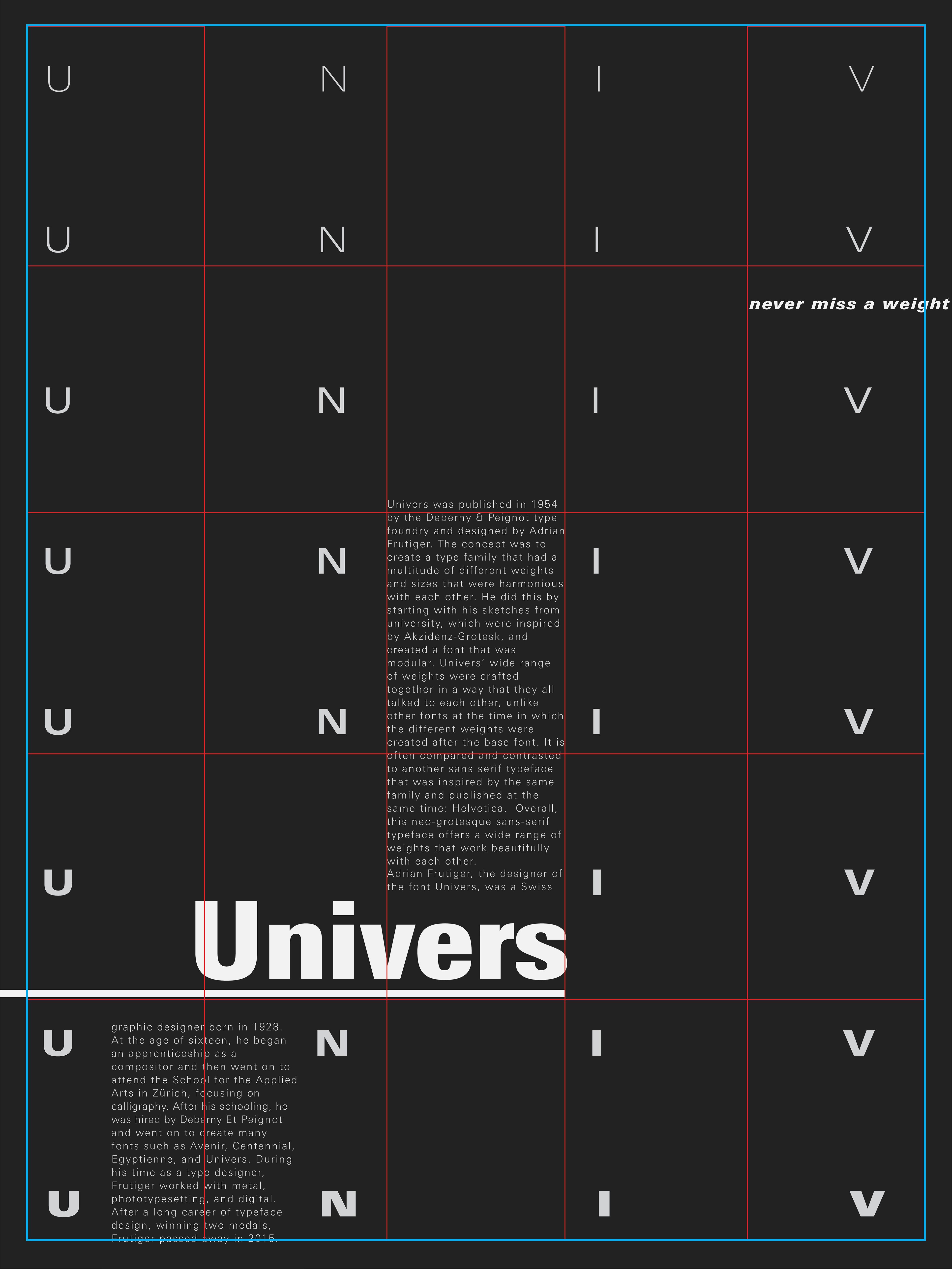
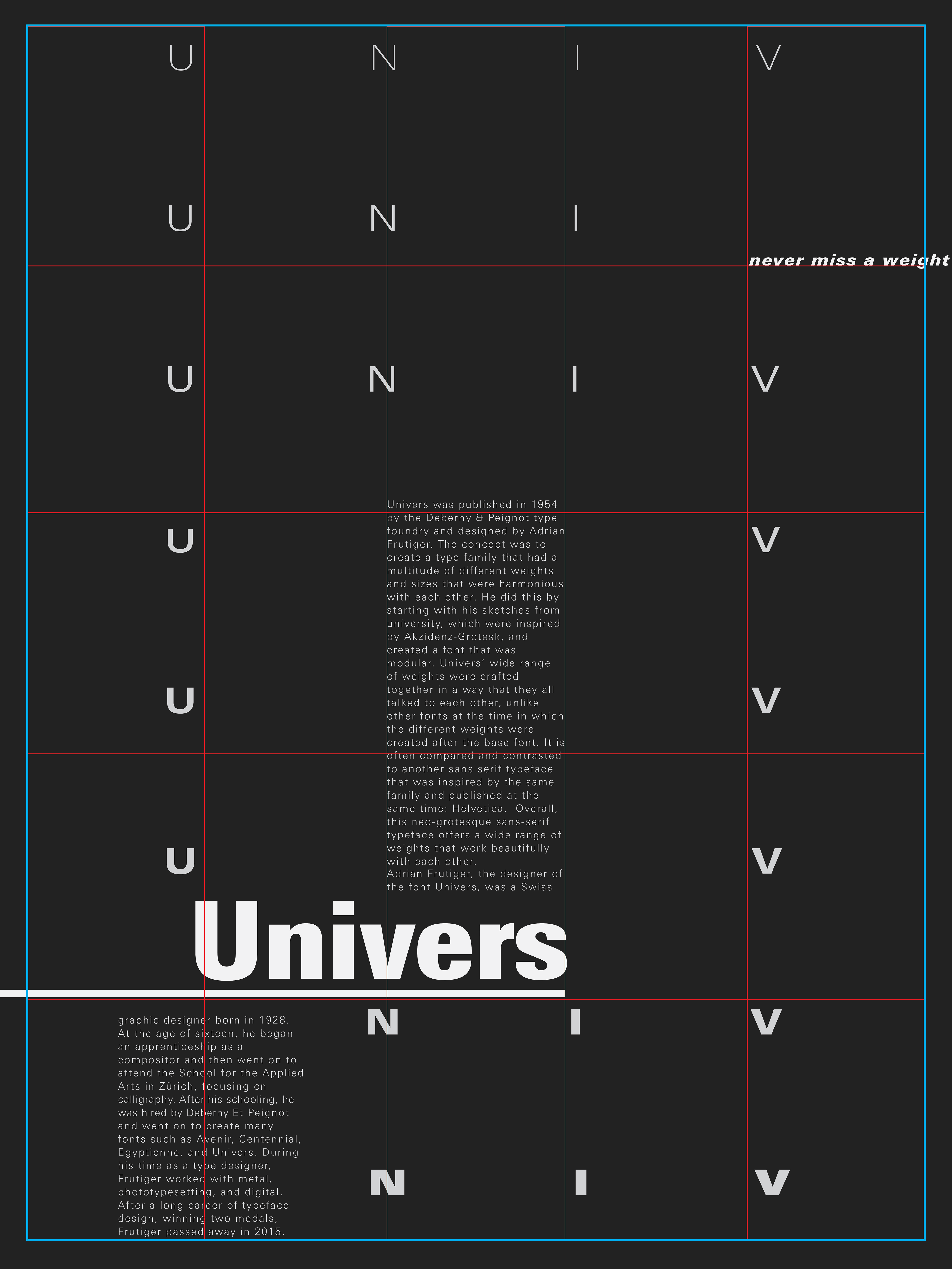
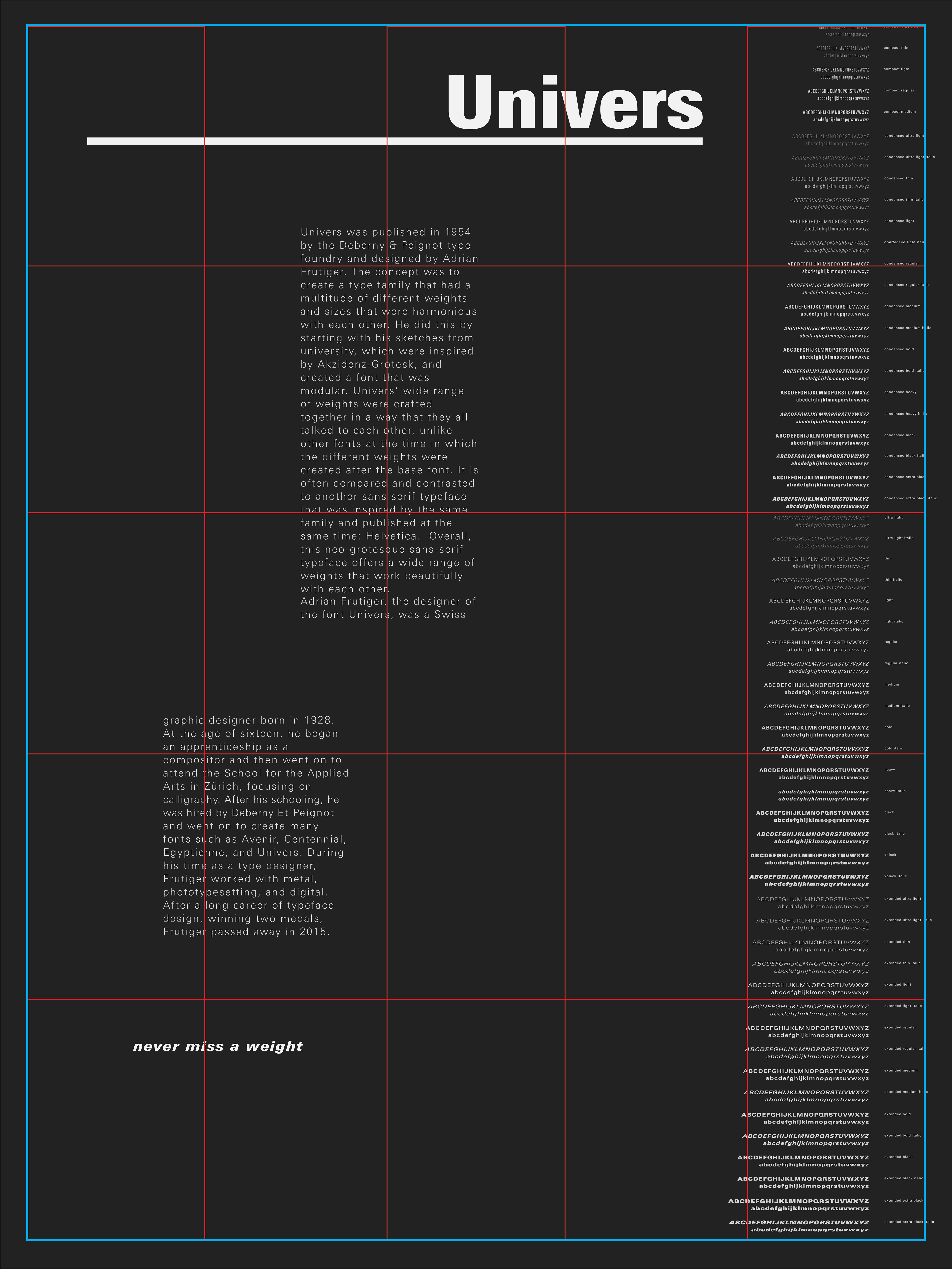
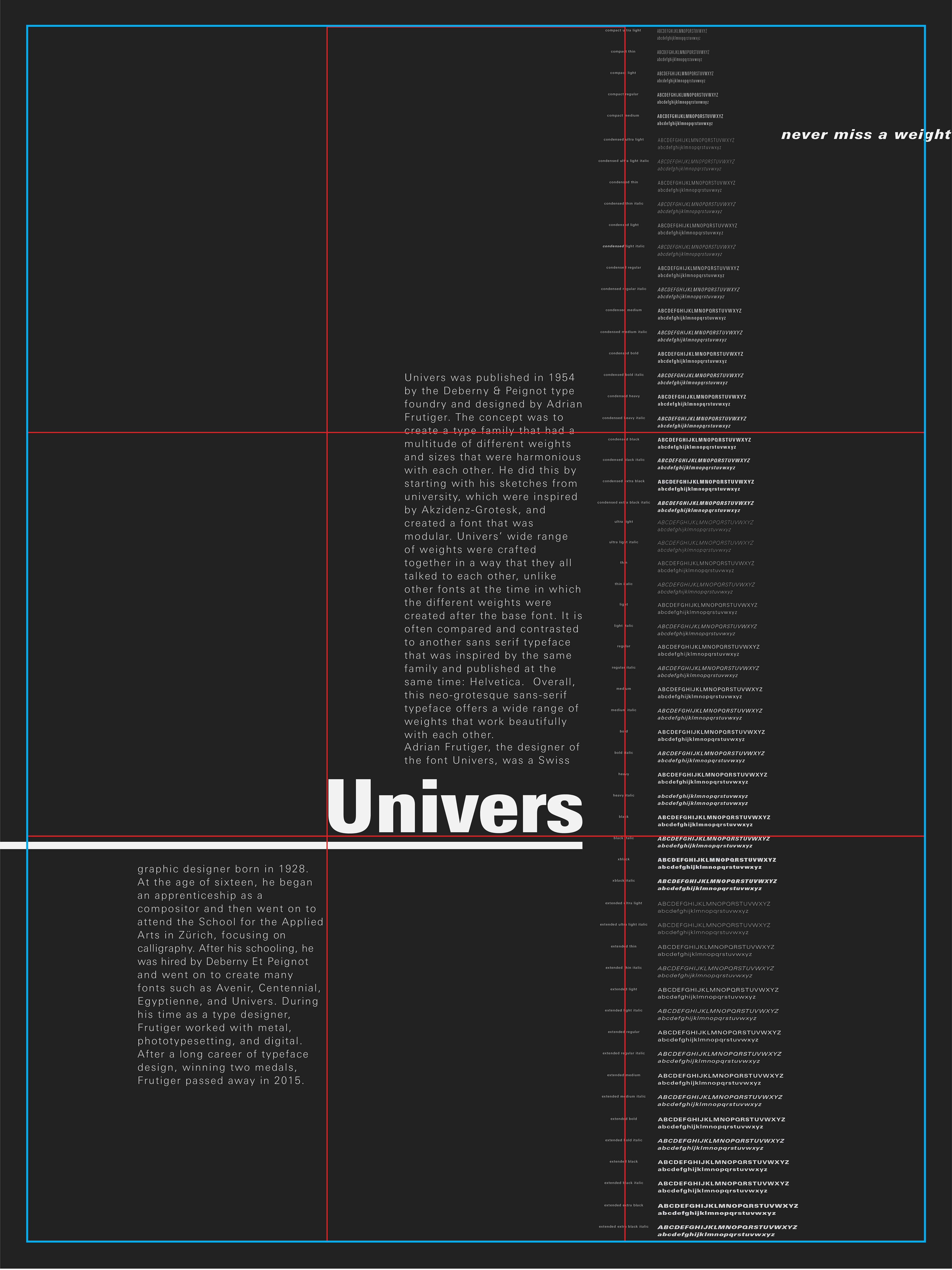
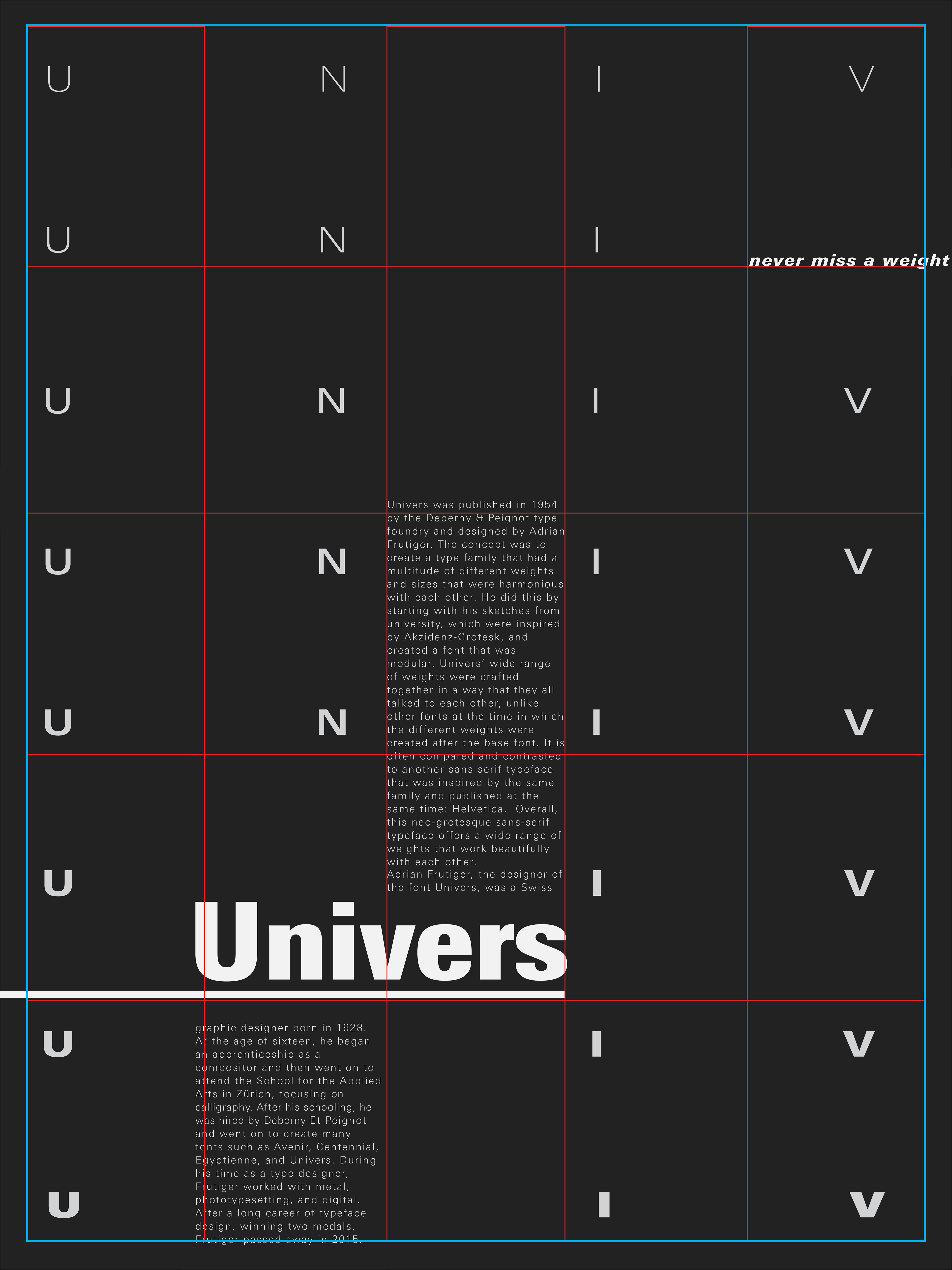
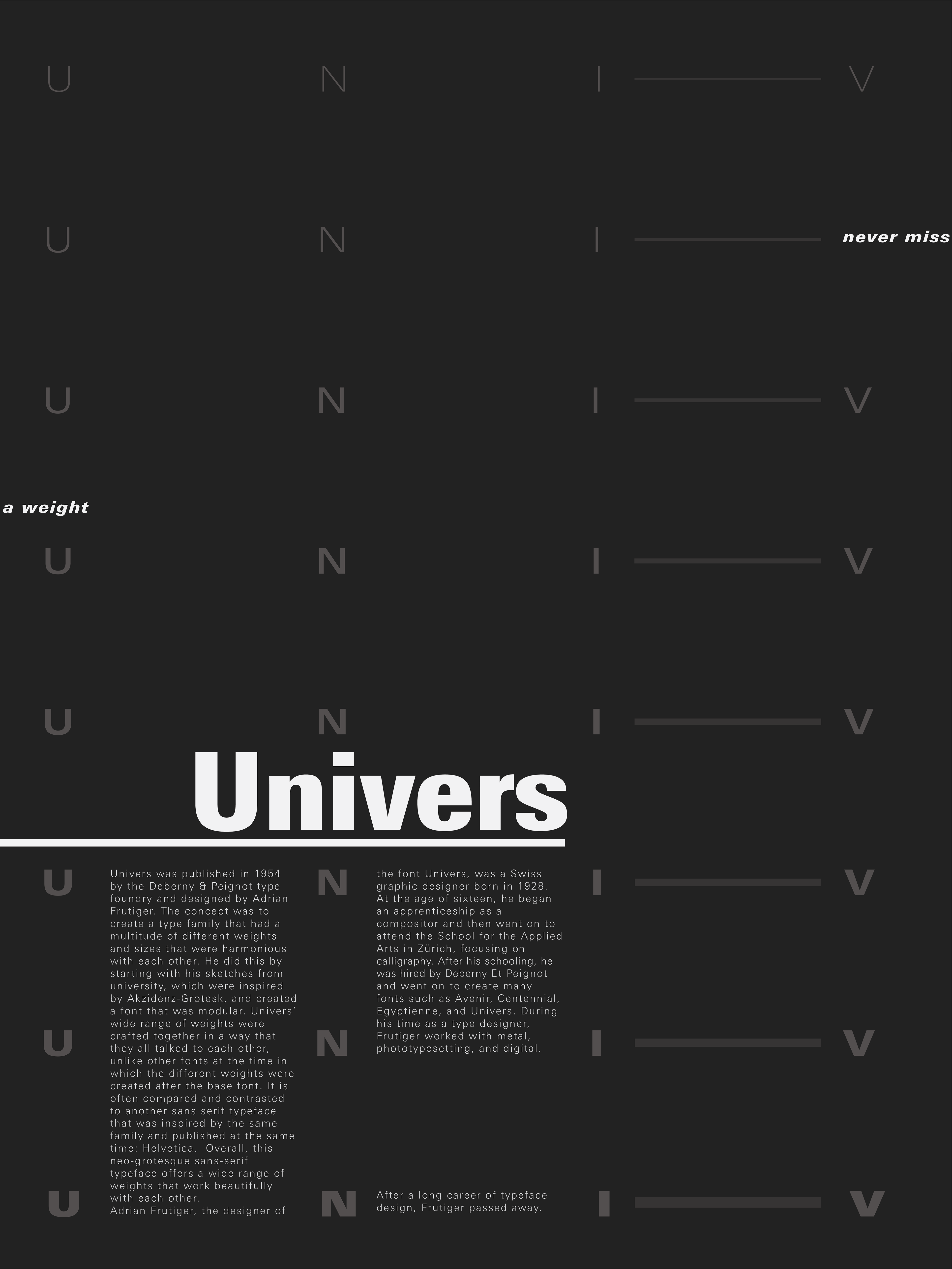
Univers was published in 1954 by the Deberny & Peignot type foundry and designed by Adrian Frutiger. The concept was to create a type family that had a multitude of different weights and sizes that were harmonious with each other, and to have a san-serif font that could be used in bigger blocks of text. Other key characteristics of the typeface include squared-off strokes that are normally round (such as the lower case g), a two-story “a” that has a straight stem, no curl at the baseline, and a perpendicular top to the bowl. Overall, this neo-grotesque sans-serif typeface offers a wide range of weights that work beautifully with each other.
Sketches & Concepts:
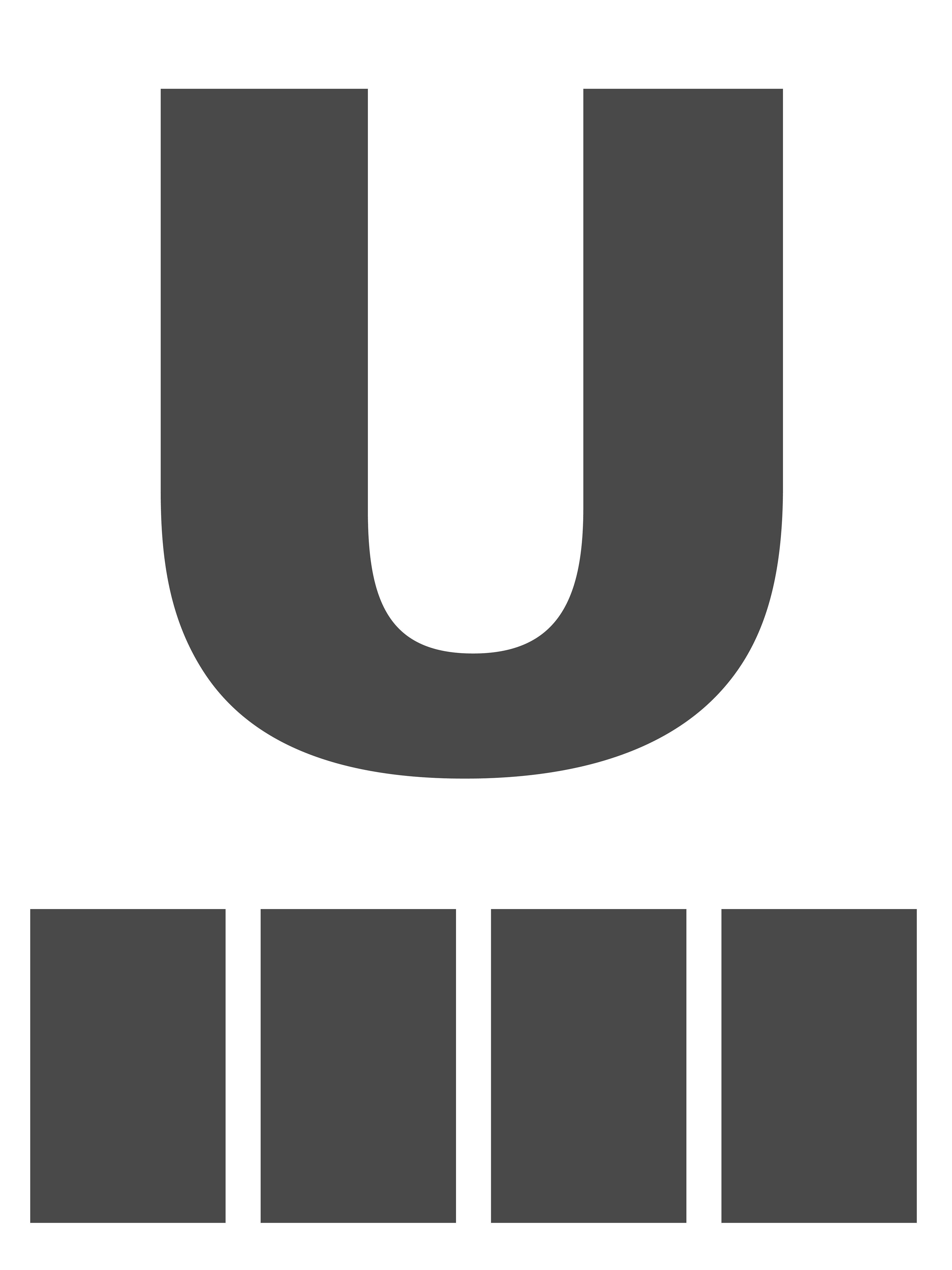
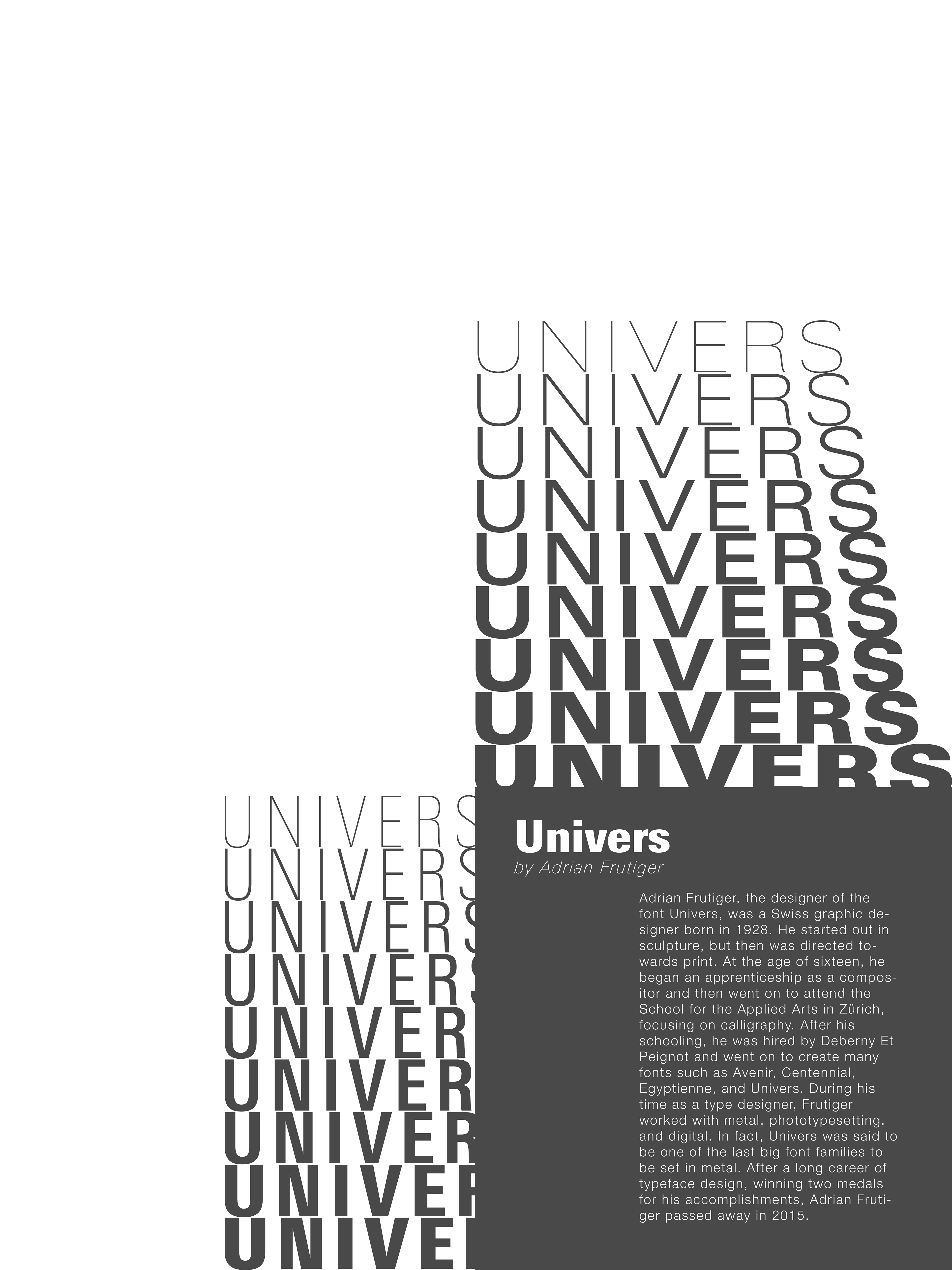
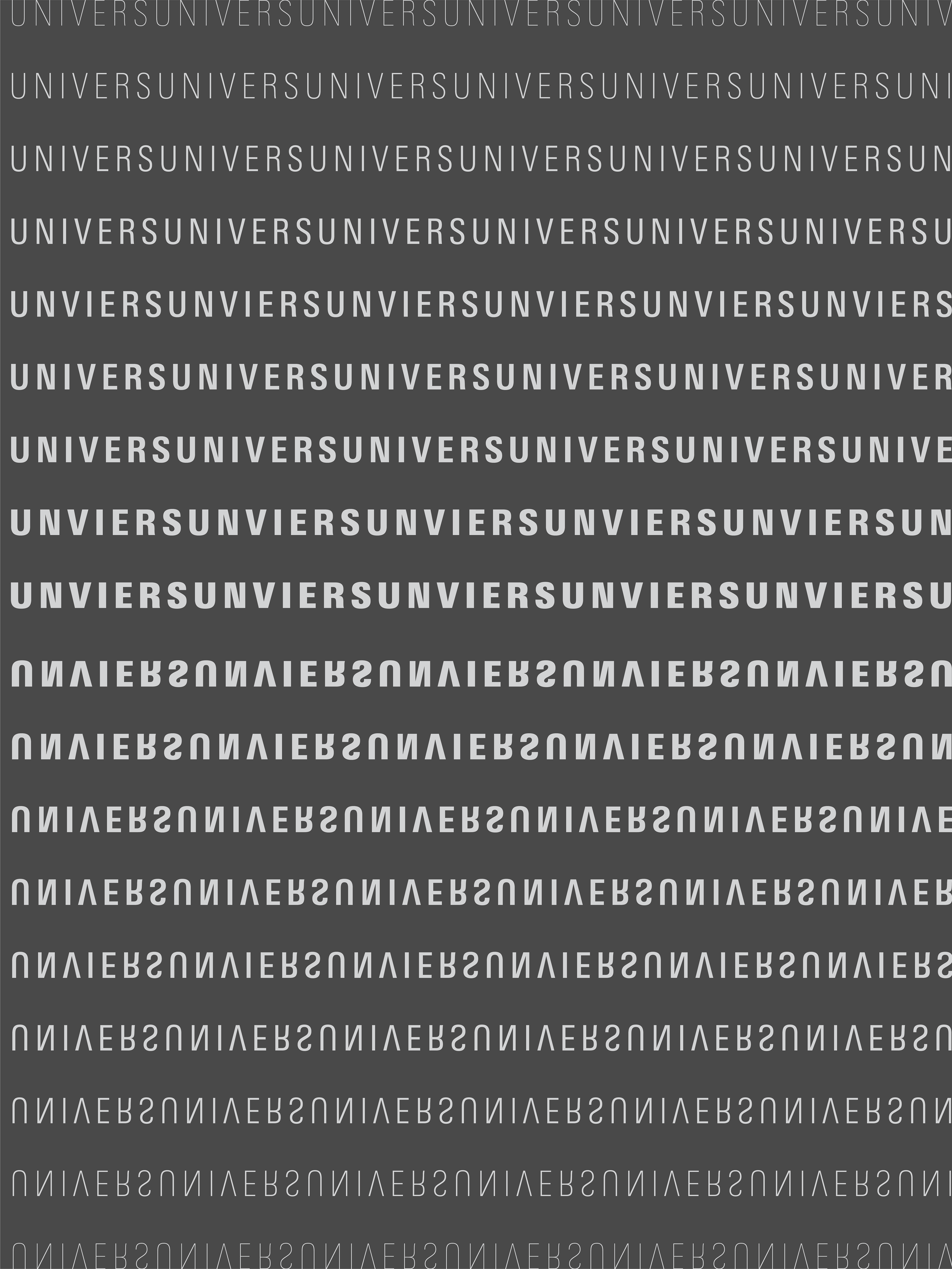
Univers has a few key characteristics that I was thinking about highlighting. First would be its lowercase ‘a’ and the uniqueness of its bowl. I might do this by blowing up this characters or using it in a larger word. Second would be the ability to use a single font that works in many weights and sizes using the whole poster in this singular font. Third would be the sheer volume of different weights that this typeface has.

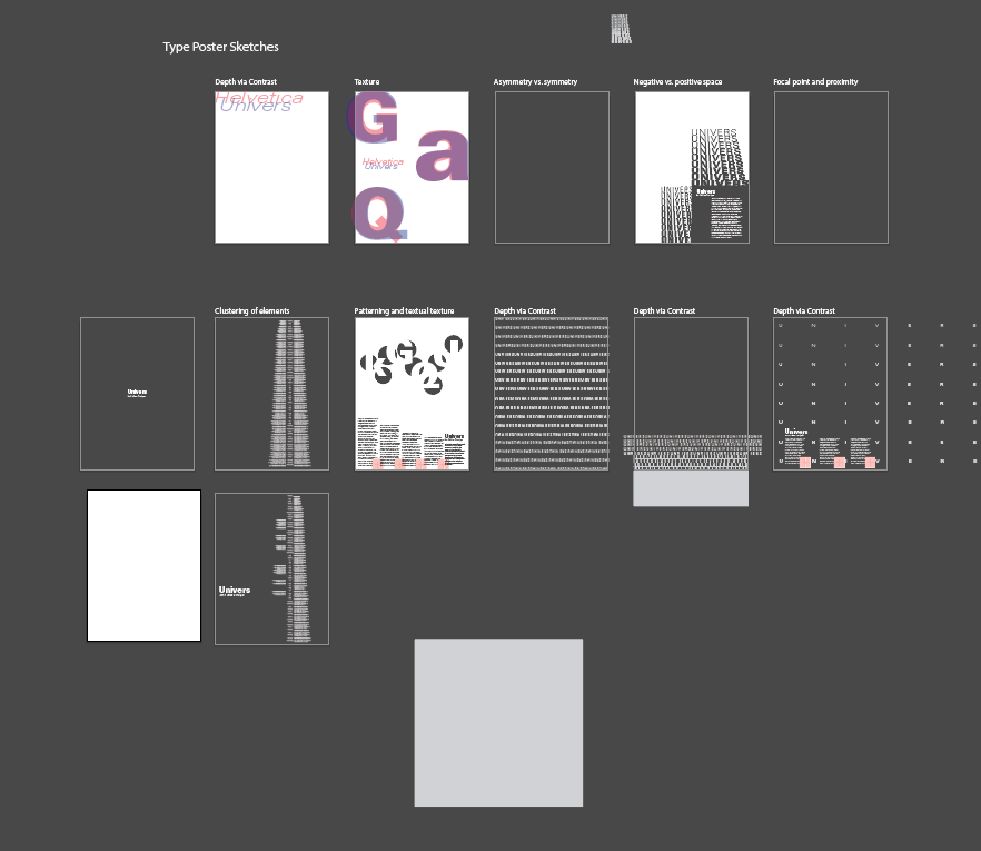
First Drafts

Second Drafts
Revisions
Final